In photography there is a reality so subtle that it becomes more real than reality.
Theme Lab
Component gallery
Real partials, real front-matter, real fixtures. Every card below is rendered with the same inputs we use on the live site so you can preview, compare, and copy/paste the payloads without maintaining screenshots.
Series badges
Reticle badges driven by the post header’s series strings, slug-aware tint swaps, and spacing tokens so legends stay readable.
Series badge — On Self
Single token
Default reticle with corner brackets for short labels.
Series badge — Downloads & Attachments
Multi-word reticle
Longer strings split around the reticle so the badge stays centered.
Series badge — Museum Archives
Slug-driven tint
Slug-specific modifiers can adjust corner colors when needed.
Download blocks
Download slots and gallery buttons that ship inside the hero masthead; every row here mirrors the data object the partial expects.
Download block — Article + Images
PDF + ZIP
Pairs article and image downloads with matching icon/note text.
Download block — Gallery + Action
Button state
Inline call-to-action blends a gallery button with supplementary text.
Metadata rows
Switch between hero metadata, location pins, TL;DR grids, and read-time attachments without touching a live post.
Metadata row — Hero baseline
Date + reading time
Standard hero metadata row with reading time and word count.
Metadata row — Location + TL;DR
Place + notes
Adds location and TL;DR list beneath the hero row.
TL;DR
- Cover-to-cover reading: 8 min
- Playful listening cards ahead
Listening cards
Now-playing cards that hydrate artwork + metadata from front matter (or fall back to placeholders).
Listening card — Track + album
Dataset-driven
Pulls artist/title/album from front matter for lightweight now-playing blocks.
Listening card — Track only
Minimal payload
Smallest footprint: artist + title only; falls back to placeholder art.
Avatars
Token-driven avatar sizes, rings, and stacks for profile treatments.
Avatars — Sizes & rings
Tokens
Small/medium/large avatars with muted, interactive, and strong rings.
Avatars & Profile Treatments
Tokens
--avatar-size-sm · --avatar-size-md · --avatar-size-lg--avatar-ring-width · --avatar-ring-color · --avatar-ring-expStack spacing offsets + ring swap for mixed identities.
<div class="avatar avatar--lg avatar--interactive">
  <img src="/images/profile.jpg" alt="Profile"/>
</div>
<div class="avatar-stack">...</div>Avatar placeholders — Guilloché seeds
Generated
Canvas guillochés act as deterministic placeholders when profile images are missing.
Guilloché placeholders
Aria
Bennett Labs
Celeste · Archives
Deterministic canvases stay consistent per seed; swap in when profile art is missing.
Quotes
Styled pull quotes using the site’s serif face and attribution.
Quote — Serif pull
Content
Pull-quote with serif body and italic attribution, matching the on-page shortcode styling.
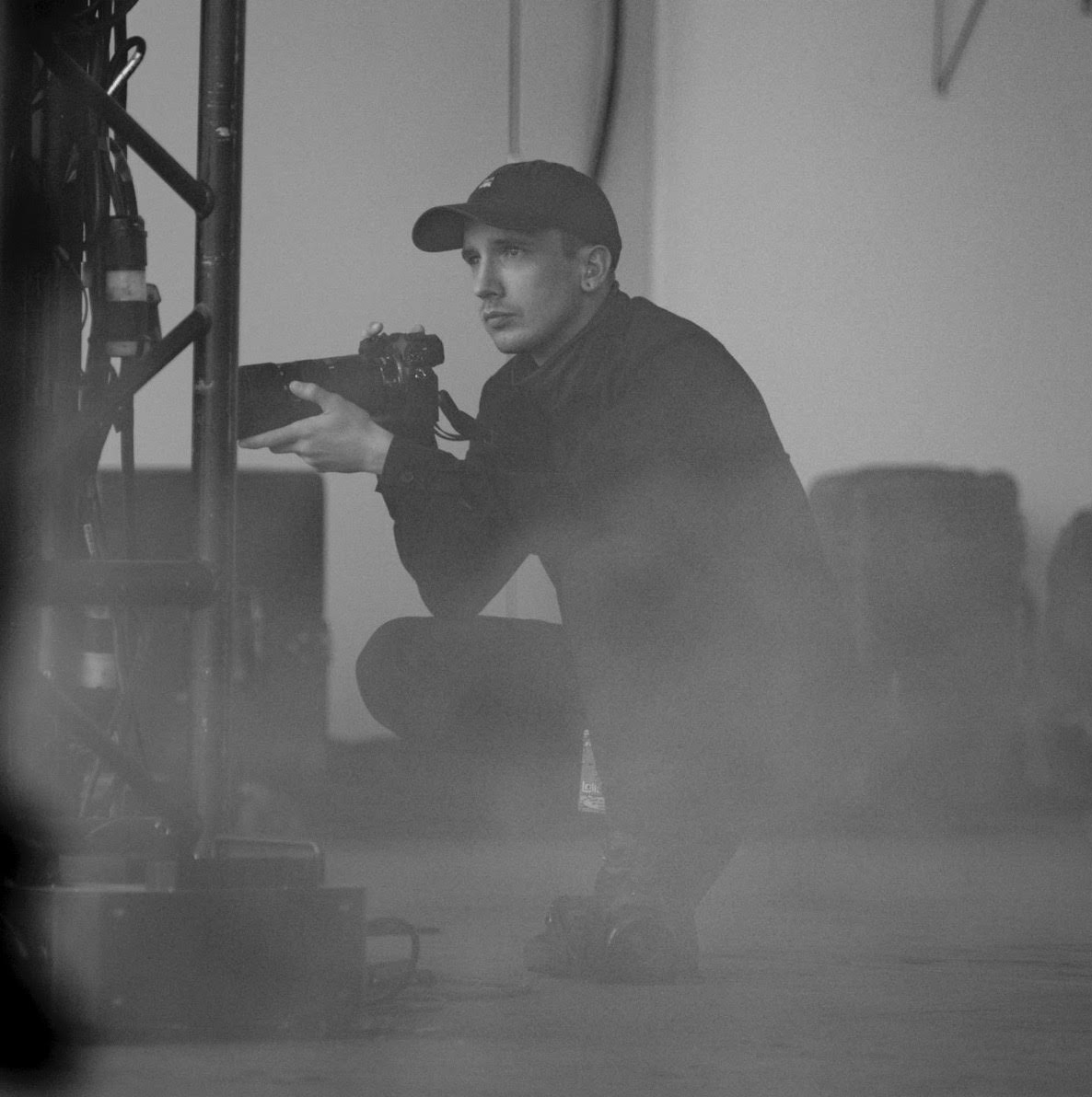
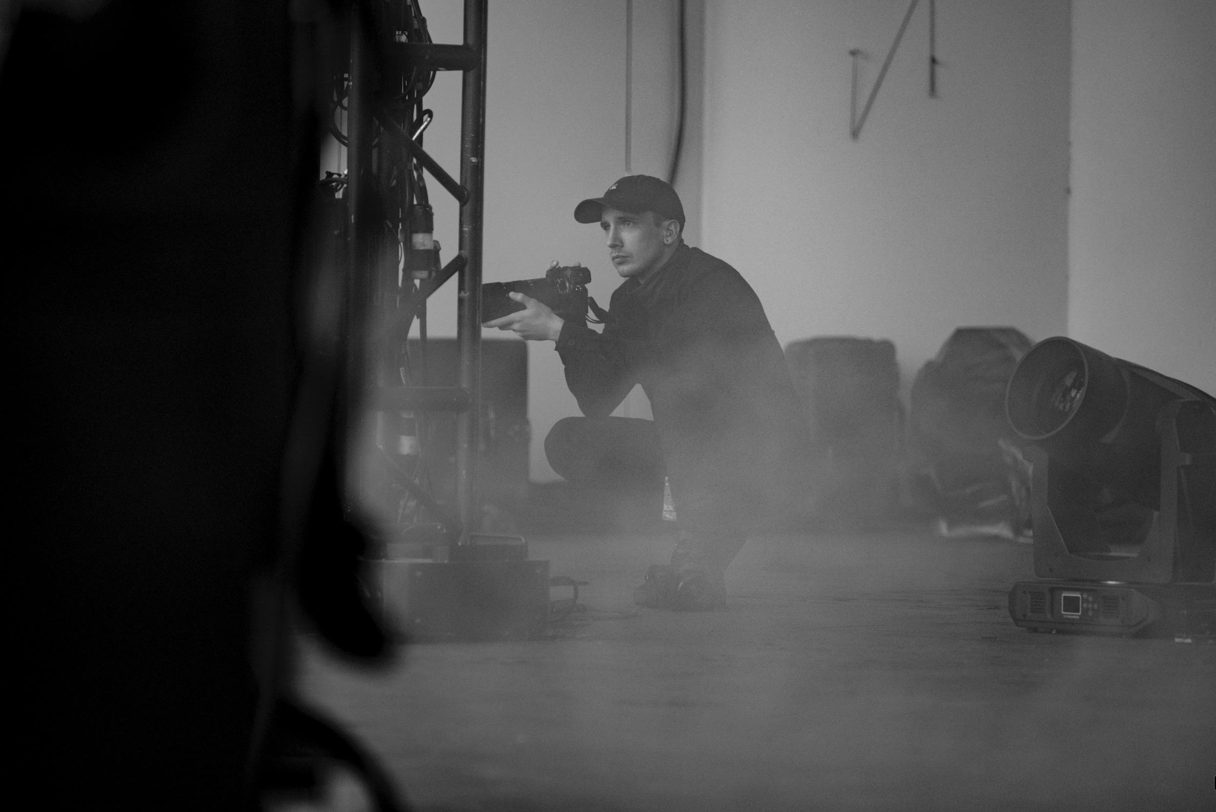
Pictures with Words
Isolated PW building blocks (hero, rail, masonry, spread, filmstrip, anchor nav) rendered from the live demo bundle so tweaks stay in sync.
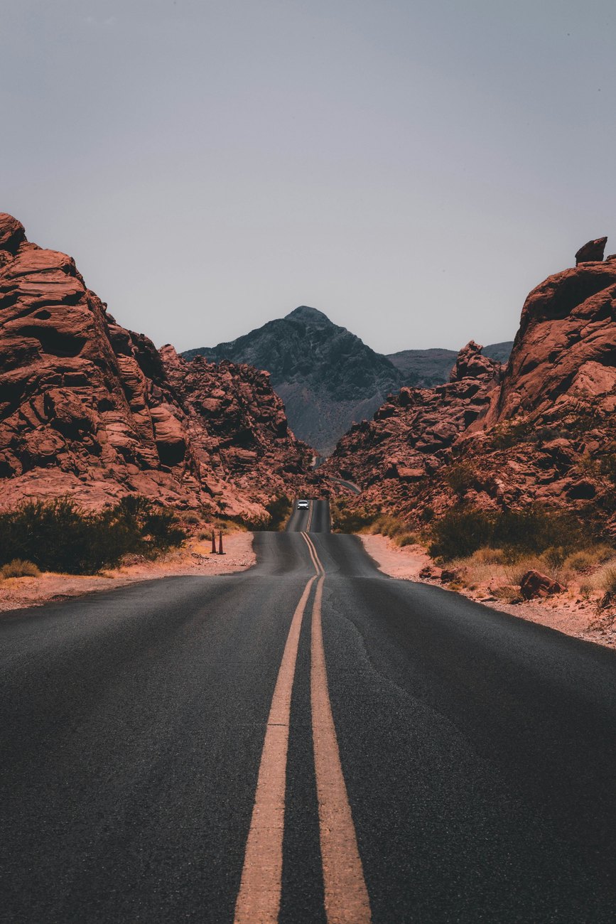
PW Hero
Centered
Full-bleed hero with palette overlay pulled from the demo bundle.
Pictures with Words
Pictures with Words Demo Manifest
How to assemble image-heavy stories with Hugo’s resource pipeline, responsive AVIF/WebP/JPEG outputs, and EXIF-aware overlays.
Image rail
6-up scroll
Scrollable thumb rail with section jump links and progress pill.


Masonry wall
3 cols
Masonry shortcode rendered against the demo bundle images.


Staggered spread
Triptych
Staggered trio spread for mid-story emphasis.


A staggered trio for mid-story emphasis.
Filmstrip
440px rail
Horizontal reel with snap points and lightbox hooks.


Drag or scroll horizontally; each frame is AVIF/WebP with JPEG fallback.
Swipe to explore
Anchor nav
Inline chips
TOC-driven chip nav used under the hero.
Jump to